THE APPLE DOESN’T FALL FAR...
Client: Vechtstreekfruit / Brand: Omoono / Category: Beverages
Market: The Netherlands / Fields: Branding, Packaging Design
When renowned Dutch food photographer/orchard owner Willem Groeneveld asked us to help out at the annual apple/pear harvest we where happy to help. When we suggested that a ‘brand/identity’ would be the perfect way to draw the necessary attention to the orchard, it’s ‘standard trees’ and the cultural heritage it represents, the collaboration that would become OMOONO, was born.
The name OMOONO is an abstraction of POMONA, the name of the Roman goddess of fruit trees.
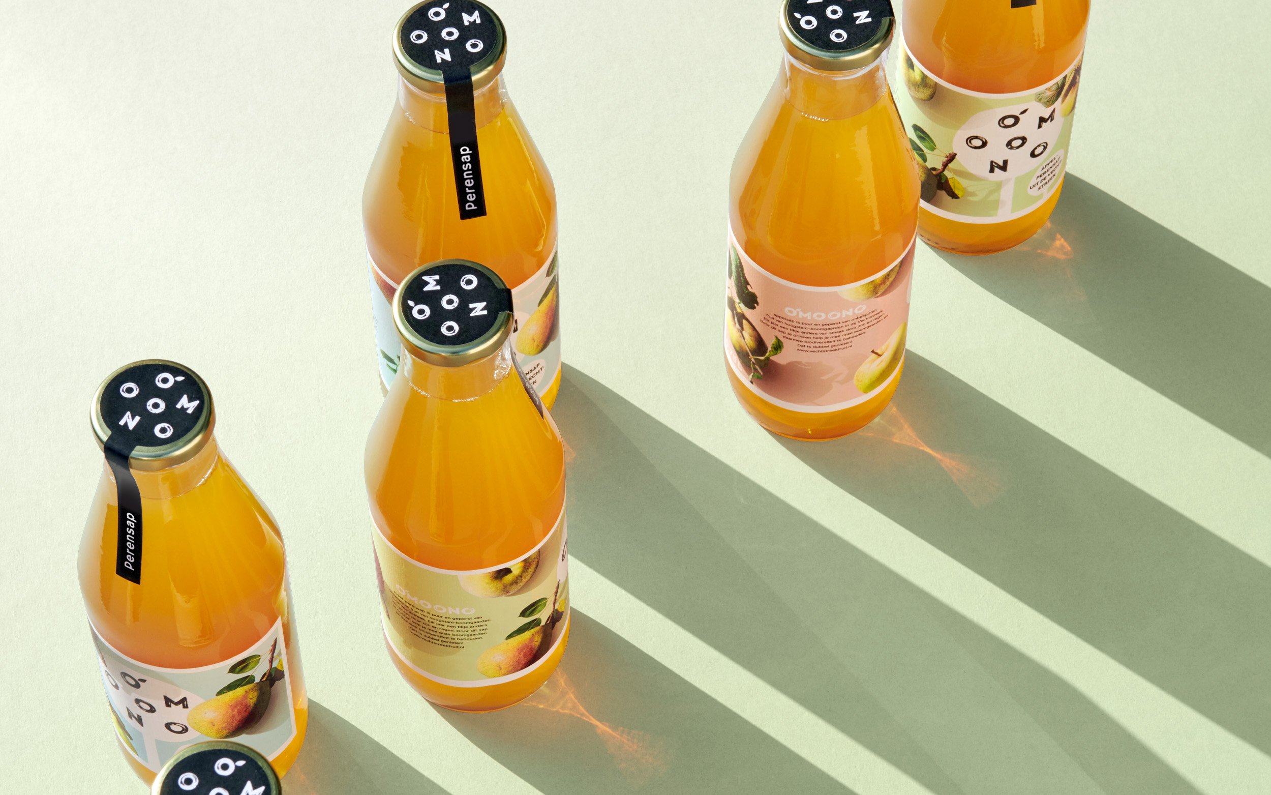
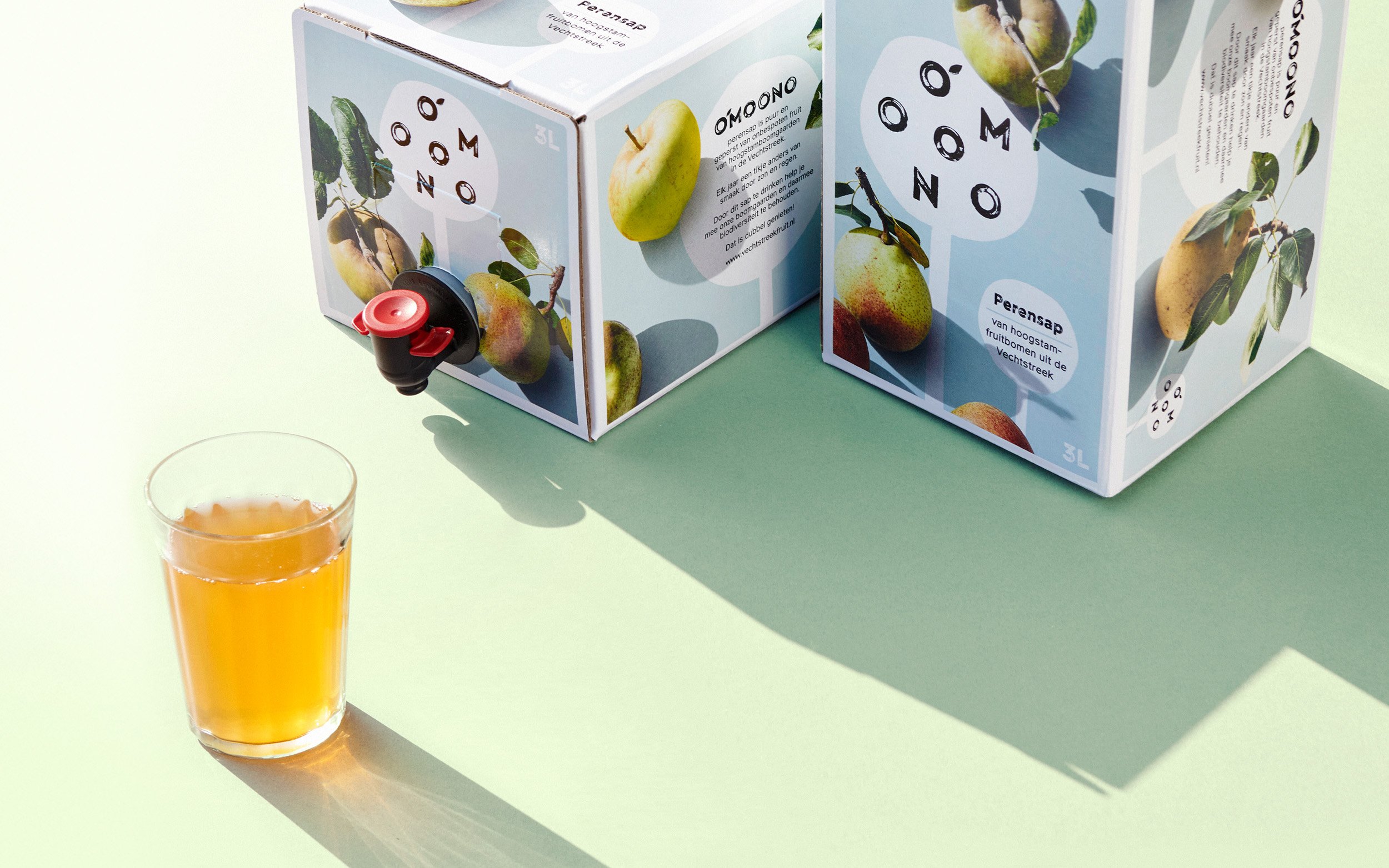
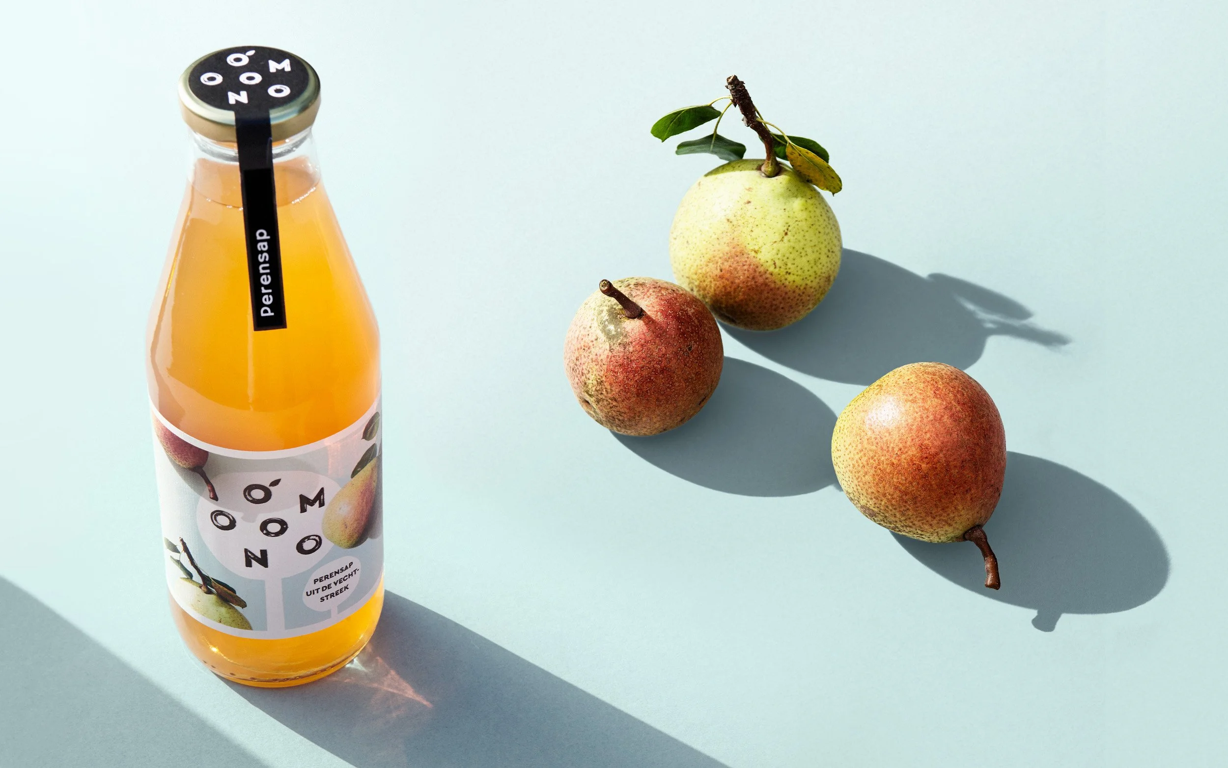
On pack, the ’standard tree’ features as a holding device for the brand name OMOONO, the letters represent the fruit itself. The idea was not to create a straight forward word mark/logo, but a highly recognizable, iconic brand identity. The consumer is urged to get involved and be intrigued by the story behind the brand.
Knowing Willem Groeneveld’s main profession, there was never a question his photography would be featured in the brand identity/packaging design. Each piece of fruit was photographed immediately after picking, on-site, in natural lighting conditions. The fruit is photographed as is, with all its perfect imperfections.
The September lighting and its typical shadow play is a major part of the overall concept.
Available now, at on- and offline local produce stores.
Straight from the tree!