HERE COMES THE SUN!
Client: Heineken Netherlands / Brand: Amstel / Category: Alcoholic & Non-Alcoholic Beverages
Market: The Netherlands / Fields: Branding, Packaging, Brand Visuals
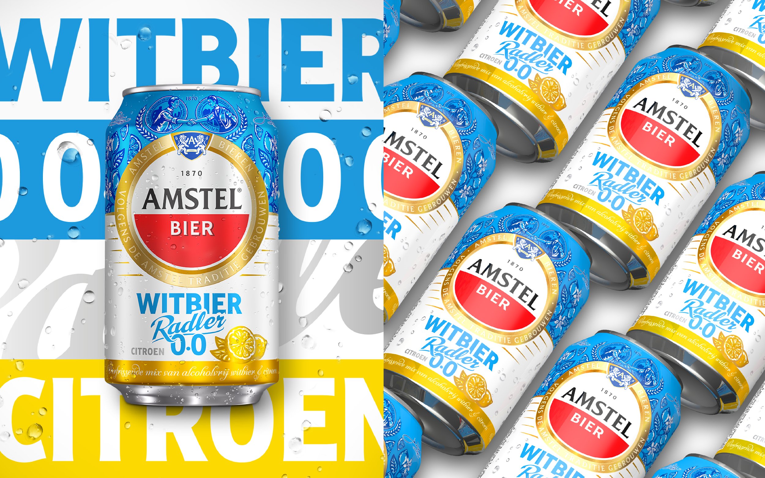
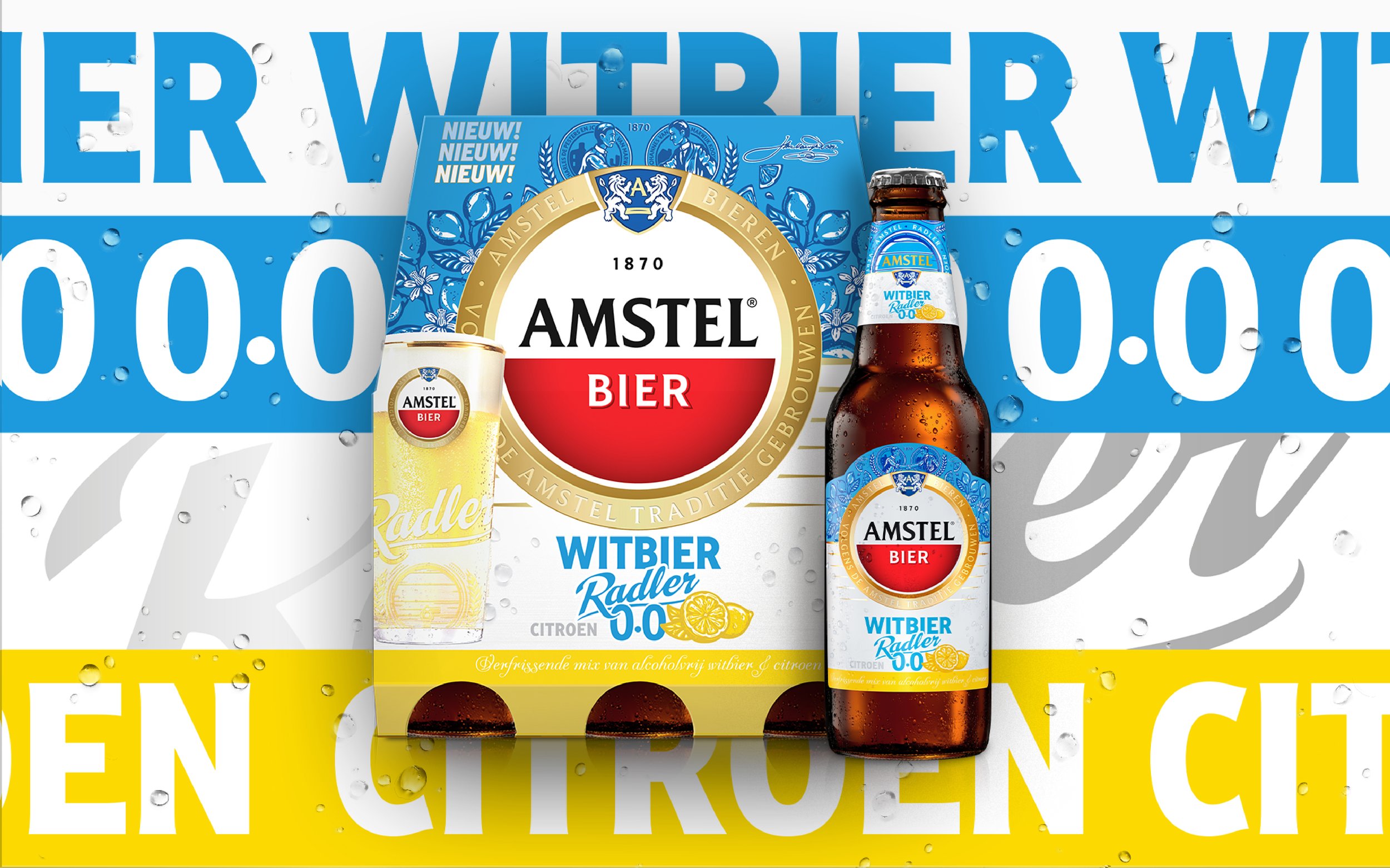
Now Even Better was asked to flex the newly made AMSTEL visual architecture to create a stunning packaging for their new Radler proposition. We re-coloured the Radler grid illustration into a bright blue to unmistakably communicate ‘Witbier’ while also knodding to the warm blue skies to come!
Enjoy the sun!