THAT’S IT!
Client: Remia/ Brand: C’est Ça / Category: BB Food / Market: Benelux / Fields: Branding, Packaging
One of Remia’s strenghths is their constant drive when it comes to product development and innovation. With C’est Ça they cater to the rising demand for allergen free, plant based products in the professional kitchen. A range of sauces (ready to use or to be used as a base) with stretch for future growth.
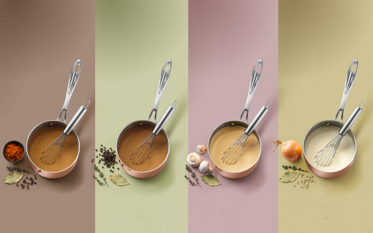
A brand that clearly stands out from it’s food service competition, in design as well as attitude. C’est Ça does things differently and that should show. The leaf-shaped logo lockup, rendered in warm grey and off-white guarantees stand out on the shelf. The ‘all natural’ character of the products is reflected in a soft, organic color palette, while the brass colored accents are inspired by the sauce pans used in restaurants.
C’est Ça!


