
BRIDGING HERITAGE WITH A FRESH VIBE
For the past 70 years, Parbo beer has been more than just a drink—it’s the heart and soul of Surinam. Known as ‘our beer,’ Parbo has stood the test of time, symbolizing pride and tradition for generations. But even legends need a fresh twist now and then, and that's where our journey begins.

ARROWS AND STAR
Suriname is a vibrant mix of cultures from five distinct origins, a legacy once symbolized by the five stars on its original flag. Today, the single star still represents this diversity. This heritage also echoed
in the code of arms on Parbo beer packs, featuring two indigenous figures with bows and arrows. These symbols inspired our new Parbo wordmark, blending tradition with modernity.
We designed a bold, sans-serif typeface for a contemporary look, adding pointed top left corners and a unique 'A' with a central star. The arrow-feather ends form the base, seamlessly integrating history and innovation, reflecting Surinam's dynamic spirit.


INTRODUCING A NEW BREW
Part of the rejuvenation strategy includes the exciting launch of a new product:
1. Parbo Bright: A tropical lager that's refreshingly light and easy to drink, perfect for the warm, laid-back vibes of the Caribbean.
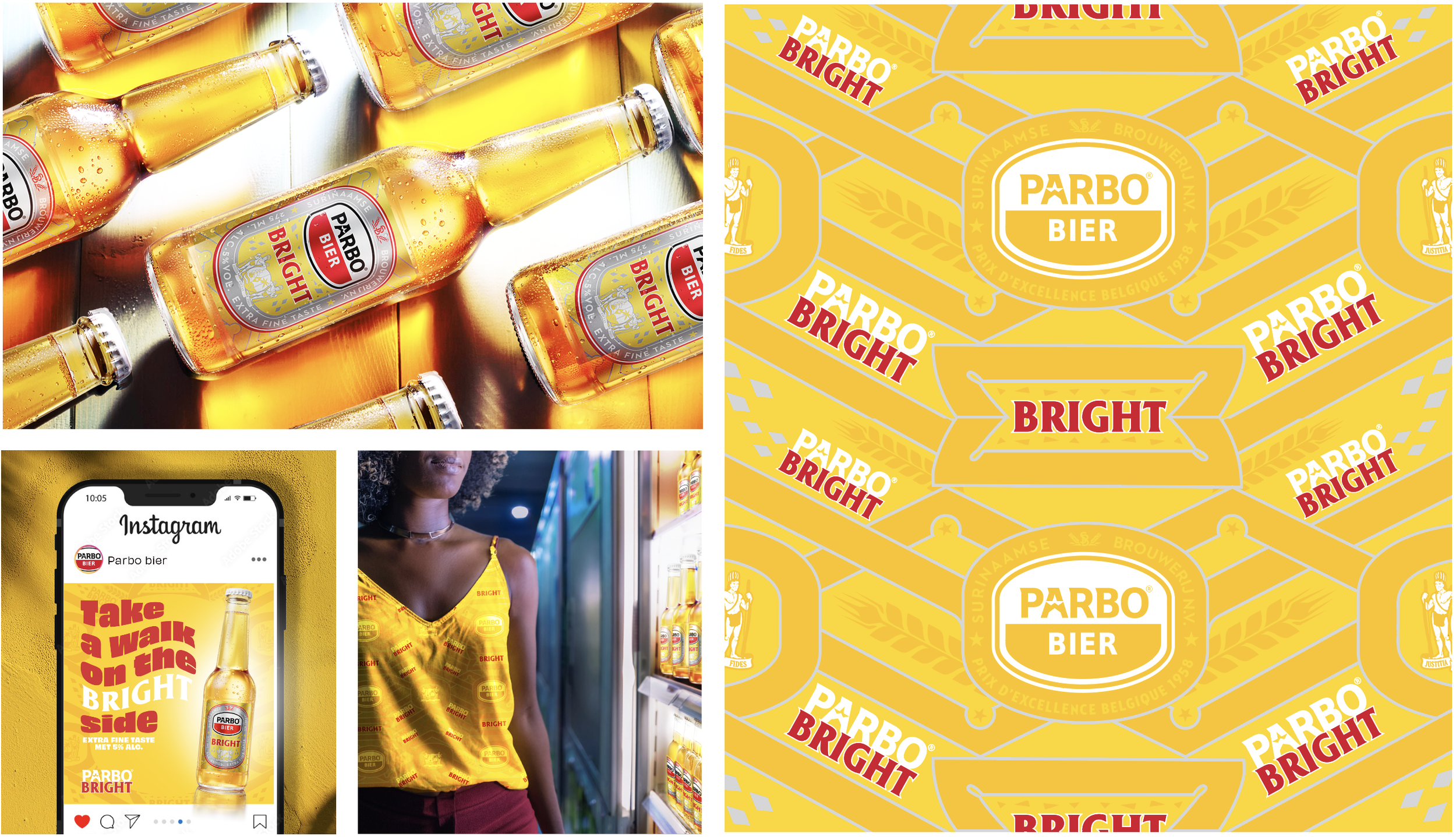

ARTS&CRAFT-INSPIRED
The Crest of Surinam and the distinctive shapes of the logo and label are integral to Parbo’s identity.
These elements are non-negotiable—they’re part of the brand’s DNA. However, we needed to infuse the brand with a unique Surinamese flair, Inspired by the arts and crafts of the Suriname people with its distinctive illustration style of intertwining lines and circles. We created our own Parbo backdrop with racing lines going through each other with the logo shape in the center where lines come
together. The illustration also functions as a design when repeated, becomes a bigger tapestry or wallpaper collage!

