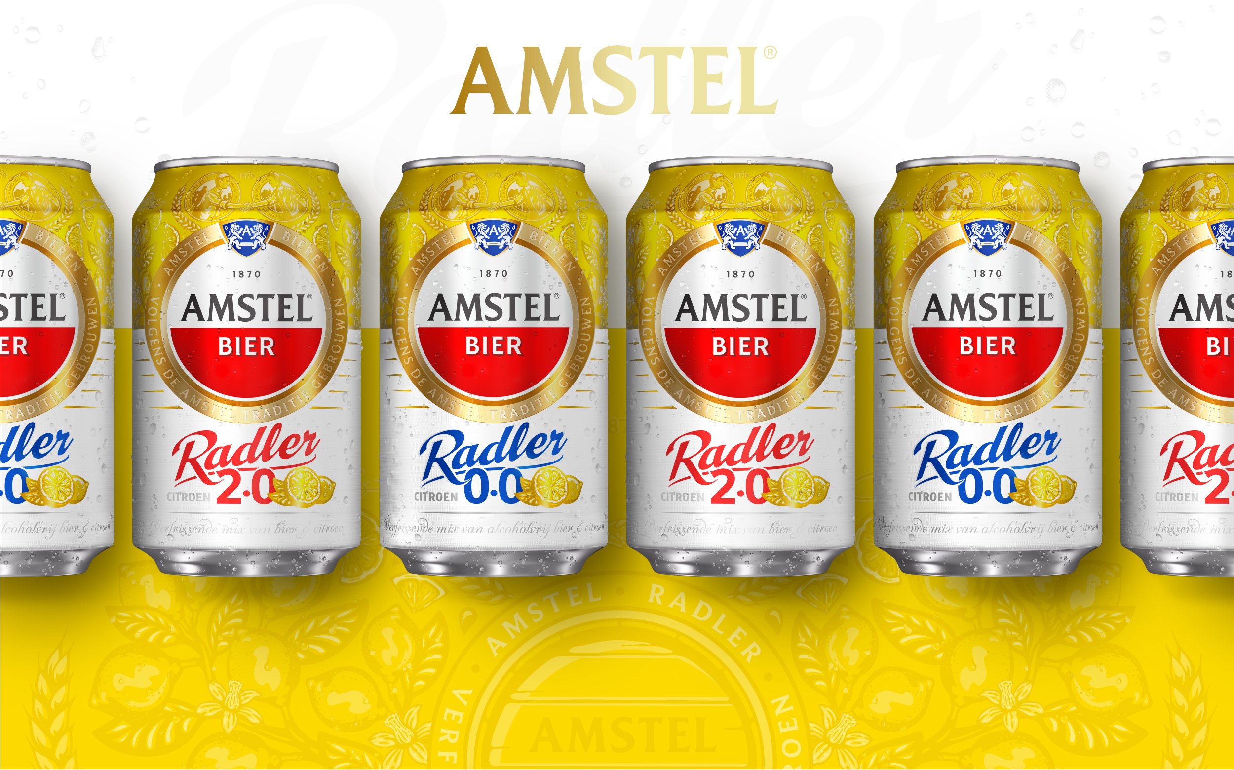
THE RETURN OF CLASS & CRAFTSMANSHIP.
Client: Heineken Netherlands / Brand: Amstel / Category: Alcoholic & Non-Alcoholic Beverages / Market: The Netherlands / Fields: Branding, Packaging, Brand Visuals
Now Even Better could not be more proud to share part of the work we did over the past 1,5 years for the latest addition to our Portfolio - Amstel (The Netherlands). After working on many new beer brands across the globe we finally had the first Dutch beer brand reaching out to us.
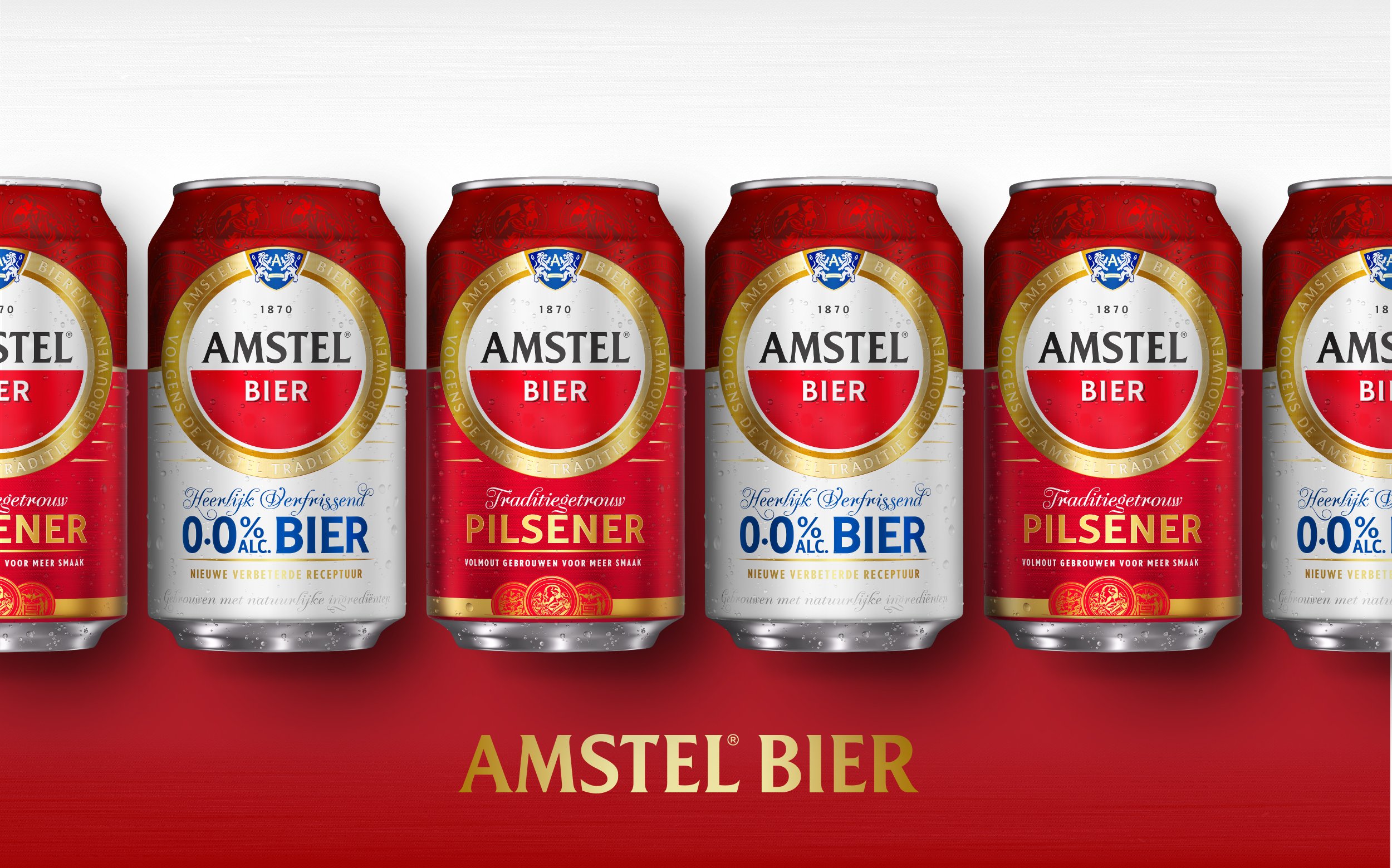
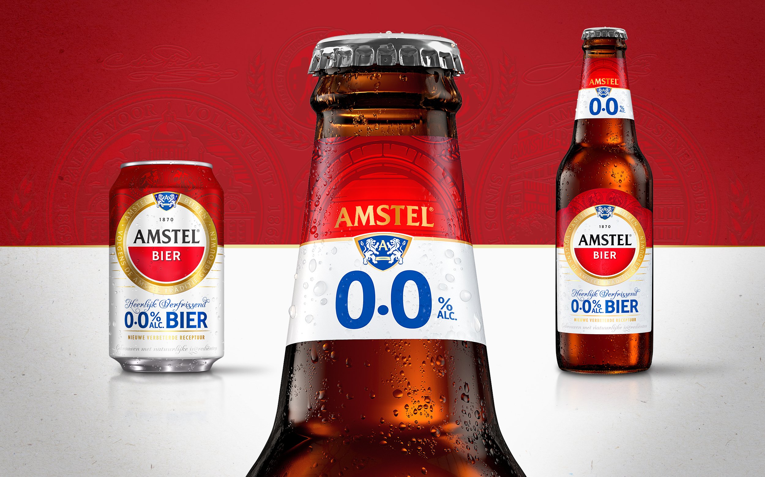
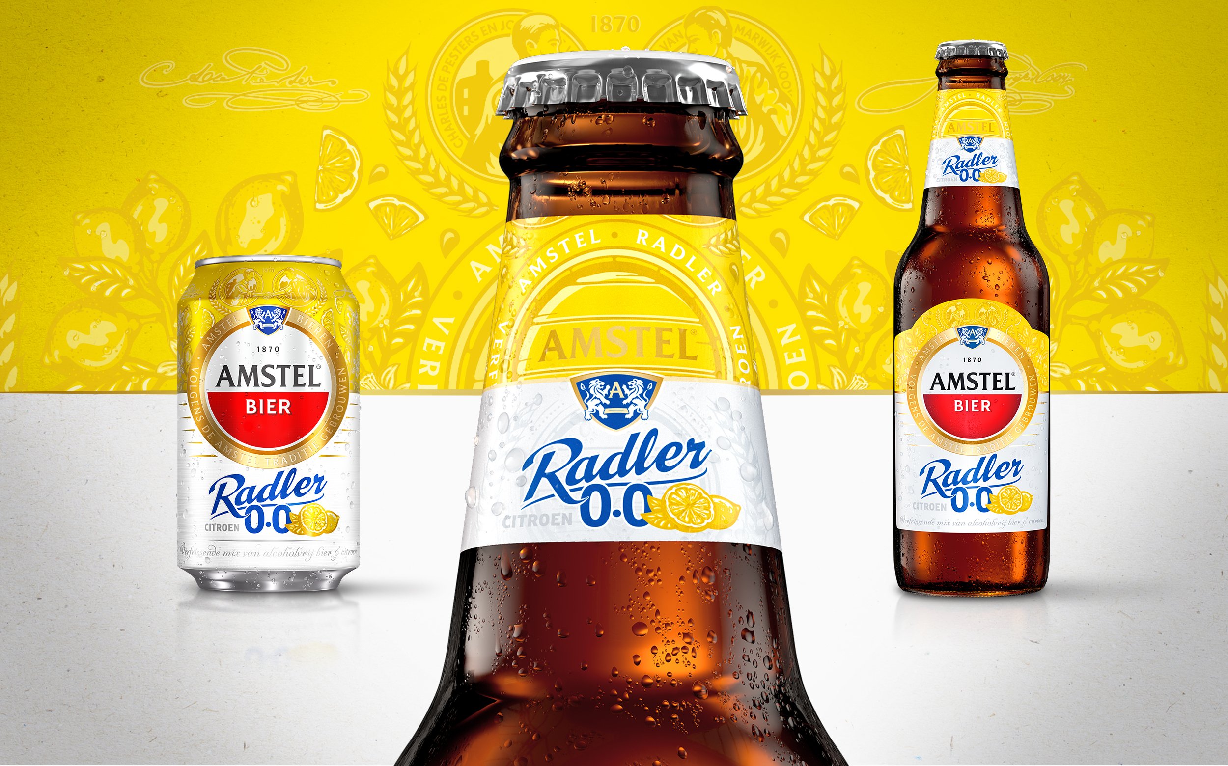
The big challenge was to bring more consistency across the Amstel portfolio, while maintaining enough individual character for the Pilsner, 0.0 Beer and Radler to asure on-shelf differentiation.
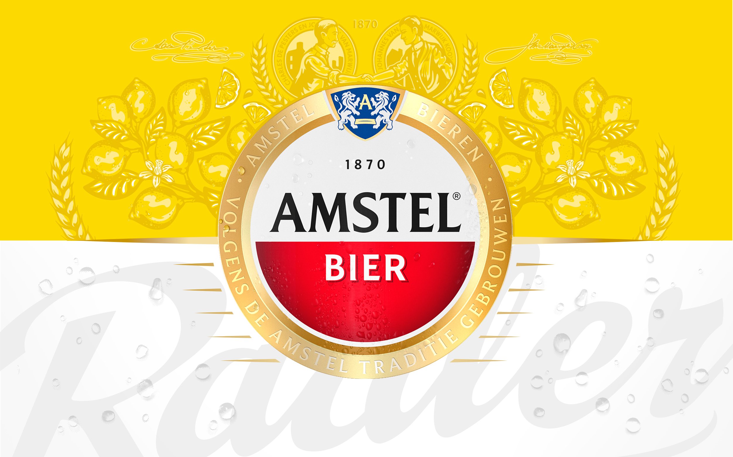
While restyling the brand, we focused on heritage, class & craftmanship viewed from a ’22 perspective, resulting in a much richer appearance of the brand.
The updated logo, divider system, illustrative backgrounds, textures, and additional assets create a whole new realm of depth and attention to detail.
Proost!
