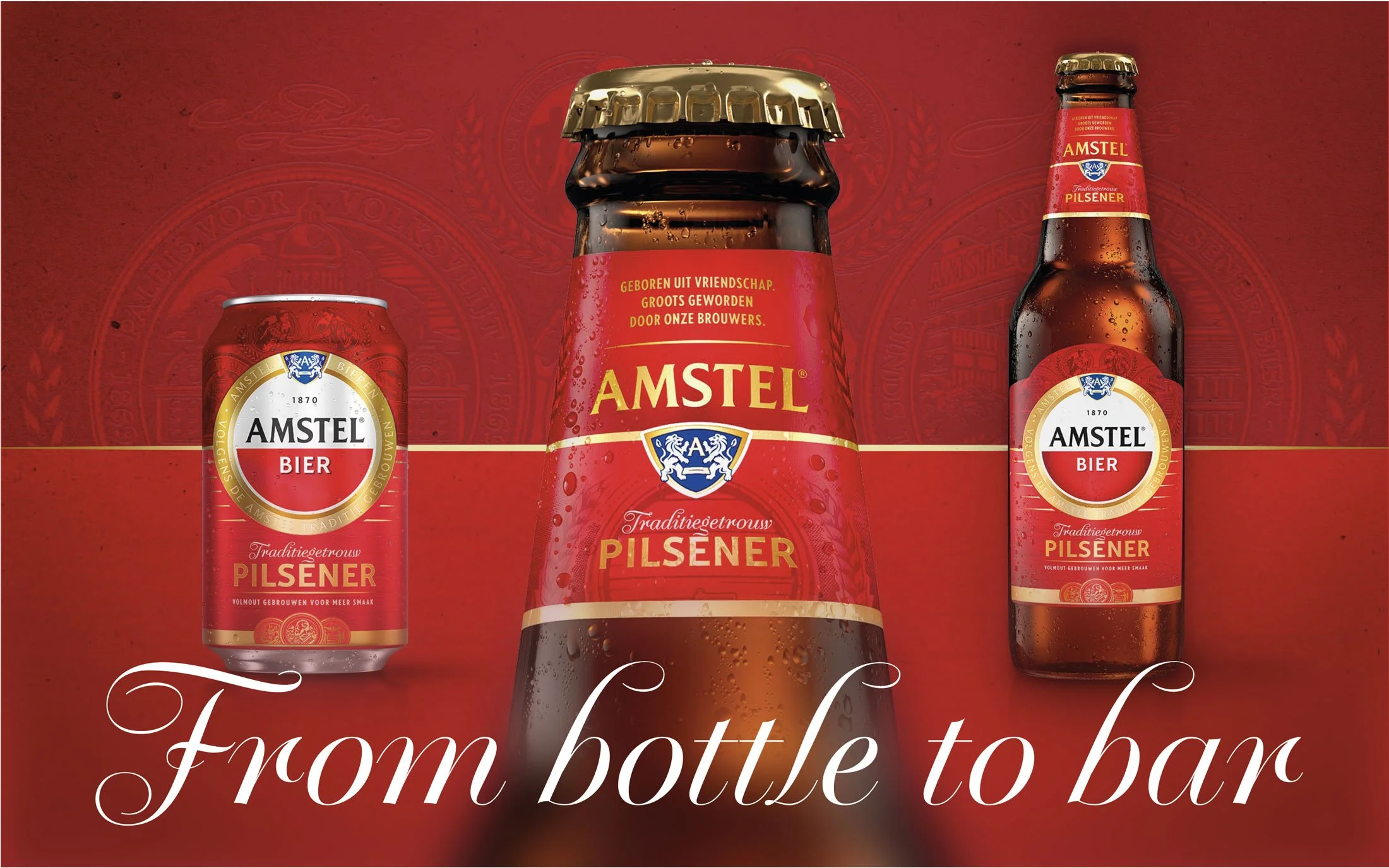
FROM BOTTLE TO BAR...
BRINGING A BRAND TO LIFE FROM LABEL DESIGN TO INSPIRATIONAL BAR ITEMS.
The more often you see something, the sooner you’ll recognize it and the more familiar it feels. This is the strength of Iconic Brand Design. It offers a brand the power to communicate in the clearest and most consistent way possible by using the same visual assets throughout. 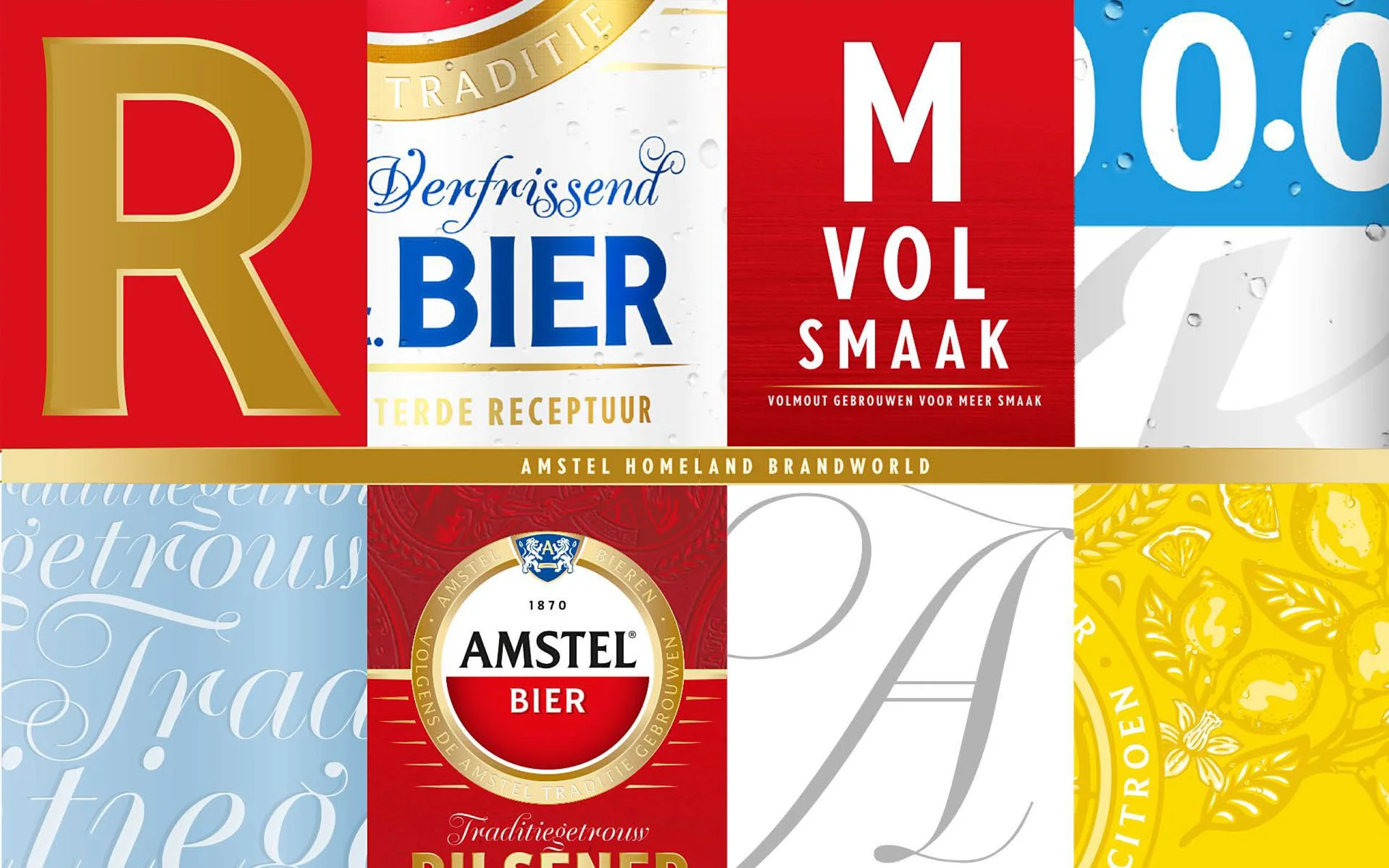
Resulting in an iconic, holistic brand world that consumers can truly relate to. Now Even Better specializes in crafting these worlds. When developing brand & packaging design, we create inspirational assets that can be used cross-medial.
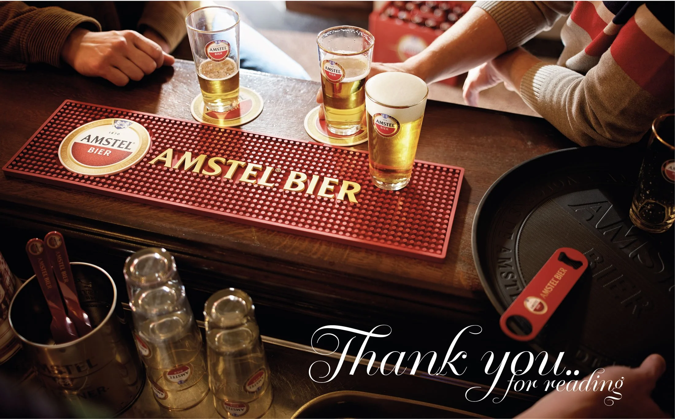
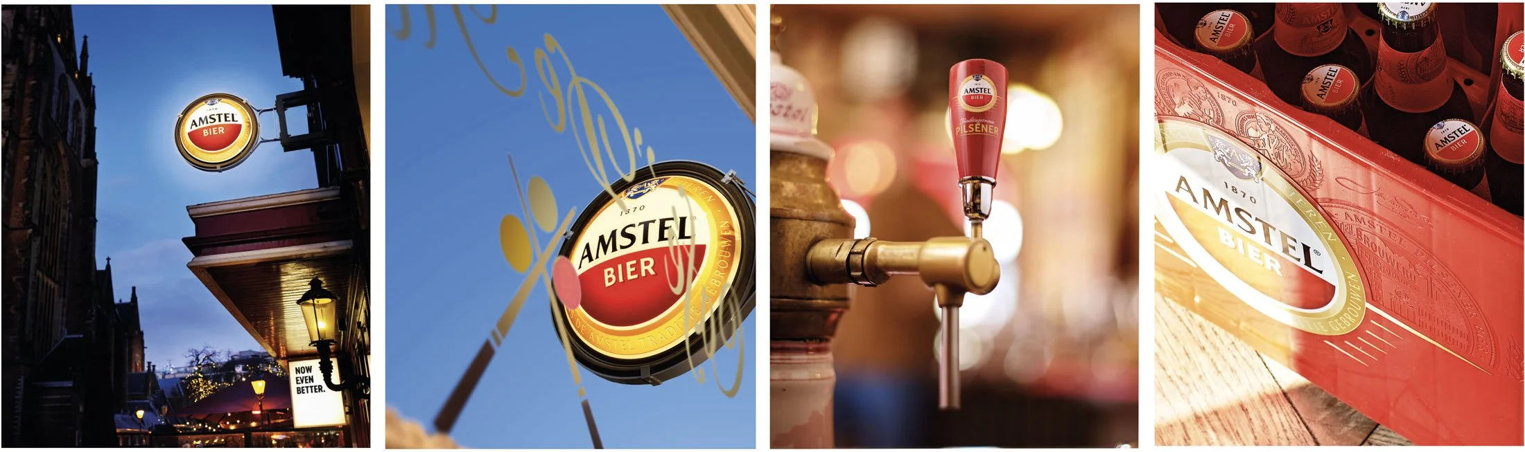
Picture conceptualizing a crate for home use, along with the illuminated signage outside a bar, the glassware for serving the beer, the coasters on top off the bar counter, the tap structure, the serving tray, and even the graphical ambiance within the bar itself.A recent illustration of the development of an iconic brand design is the comprehensive overhaul of Amstel beer in the Netherlands 2022 -2025. In this instance, the objective was to impart a more traditional appearance and ambiance to the brand and all its elements. The so-called: ‘Bier sjiek’ / ‘Brown bar’ look and feel 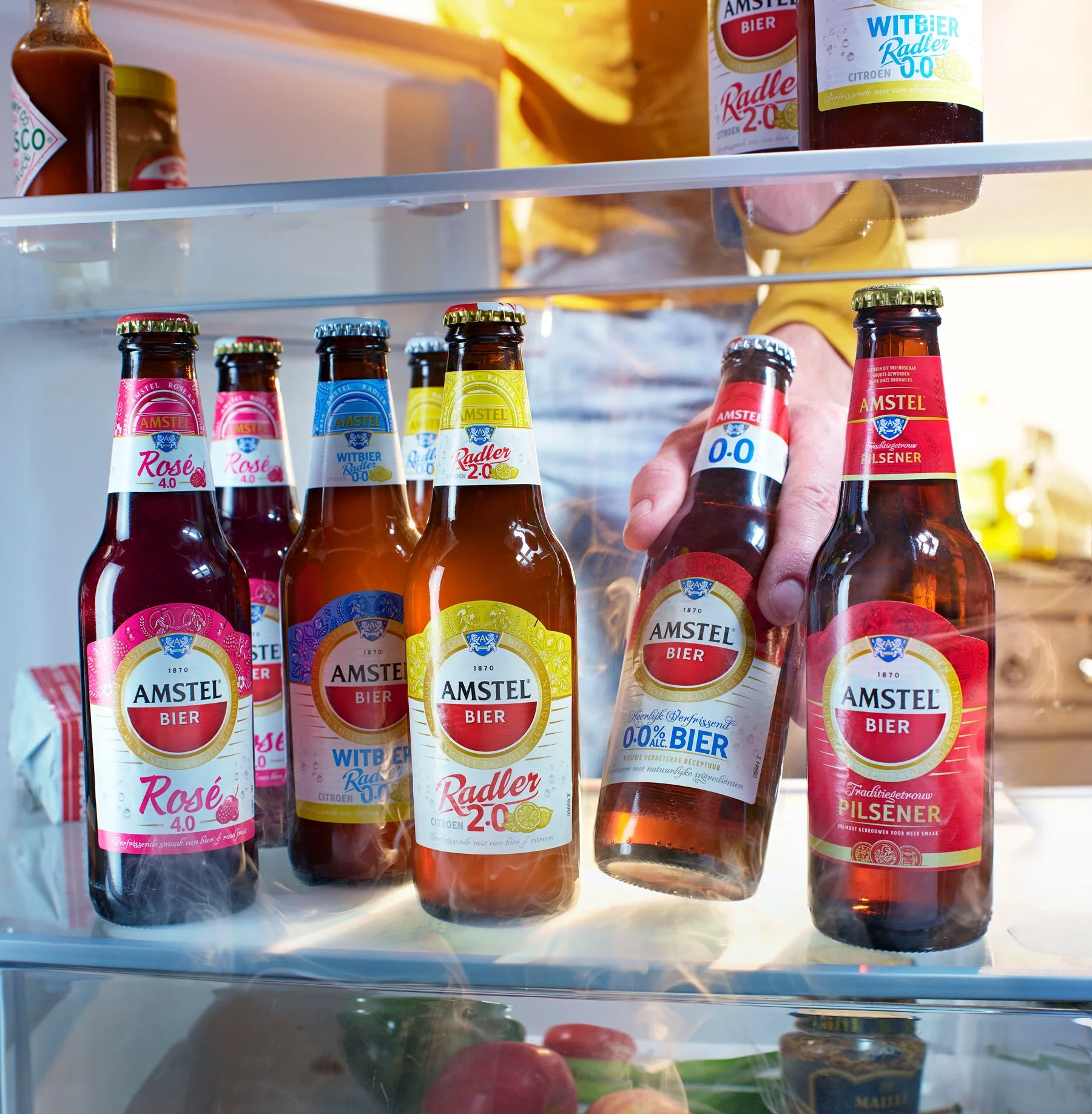
spanning from the bottle to the bar and to establish a more cohesive packaging range for its diverse flavors. Our approach involved the creation of fresh bottle labels, can designs, and supplementary packaging. However, for a beer brand, the realm surrounding the bottles and cans encompasses more than one might envision. 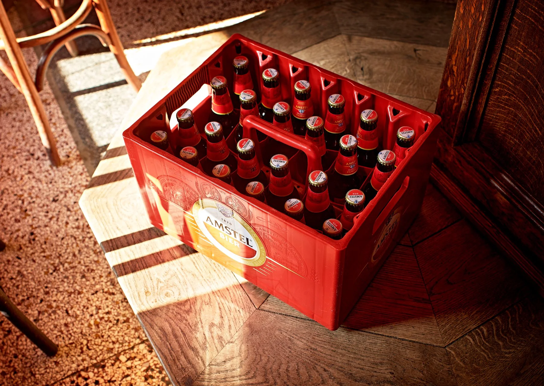
Collectively, these elements contribute to a more consistent and cohesive brand image, ultimately aiming to foster a deeper connection with consumers and drive increased sales.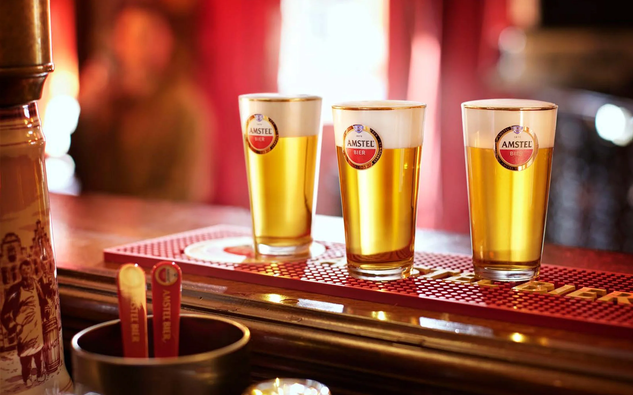
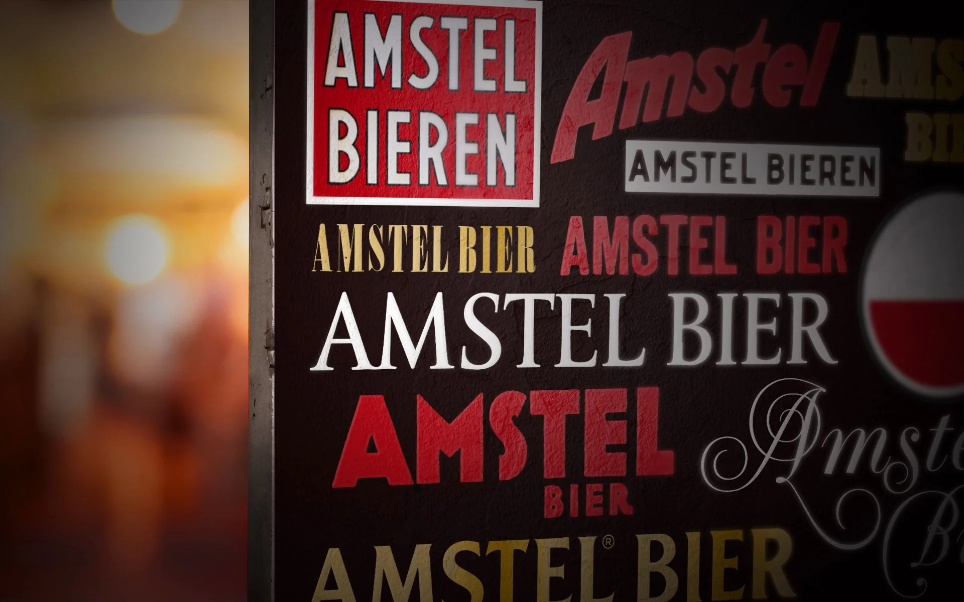
Creating new assets for the Amstel brand that could be used in more contexts than just the packaging was inspired by the rich heritage of the brand. This heritage provided both inspiration and direction to incorparate the brand strategy. Key elements included the iconic brown bar Krull sign-painter typography, along with other traditional Dutch fonts like Nobel. The golden bars on the side of the 'Toog' (wooden bars typical of brown bars), as well as the use of tiles, stained glass, and historical wordmarks from the brand’s logos throughout the decades, were also key influences.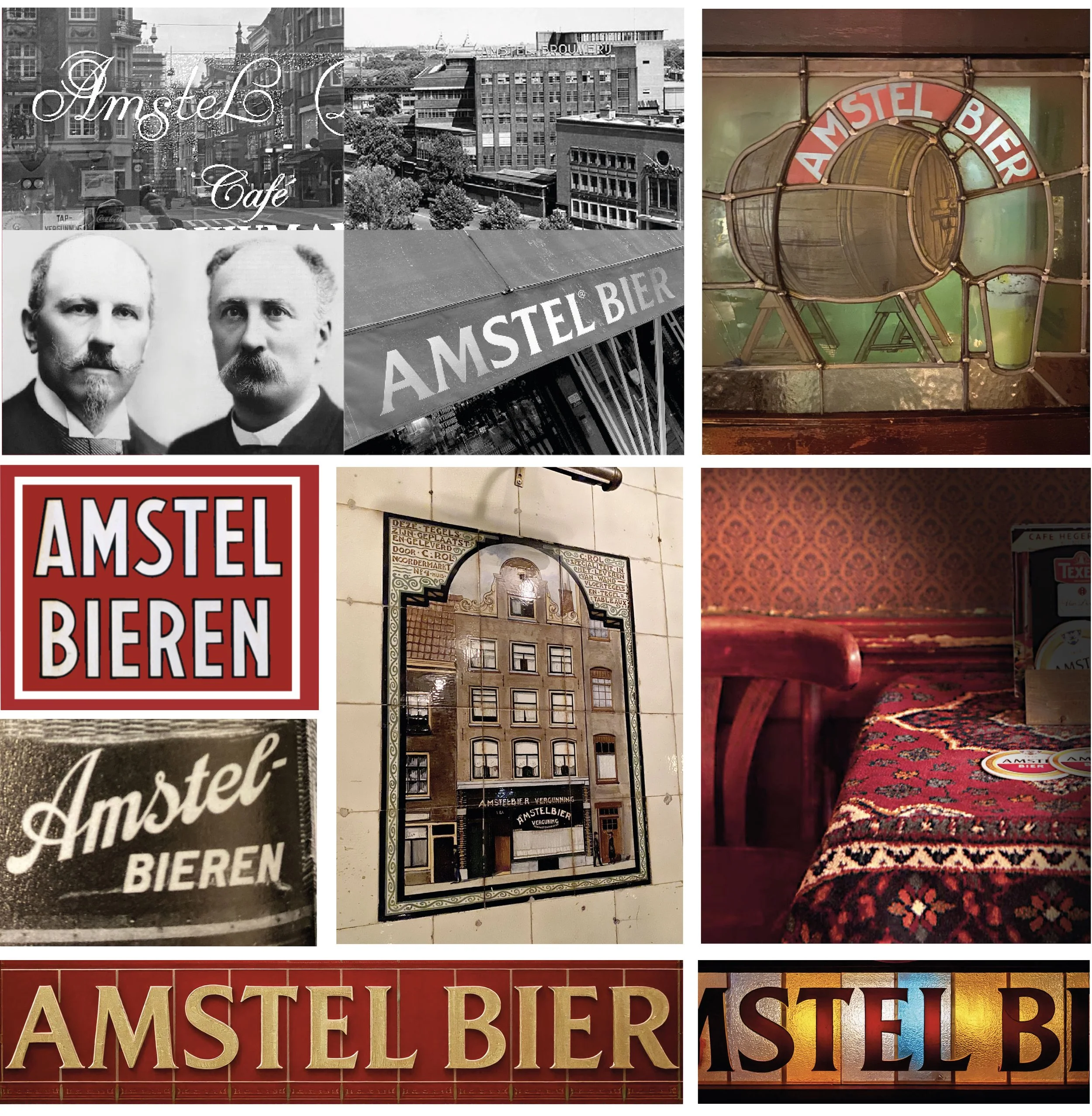
These elements were brought to life through the inspirational concepts and illustration styles we proposed. Some of these ideas have even been used in actual mural paintings inside and outside Dutch brown bars! We also emphasized the use of more gold in the design, incorporating golden banners and spikes. We highlighted 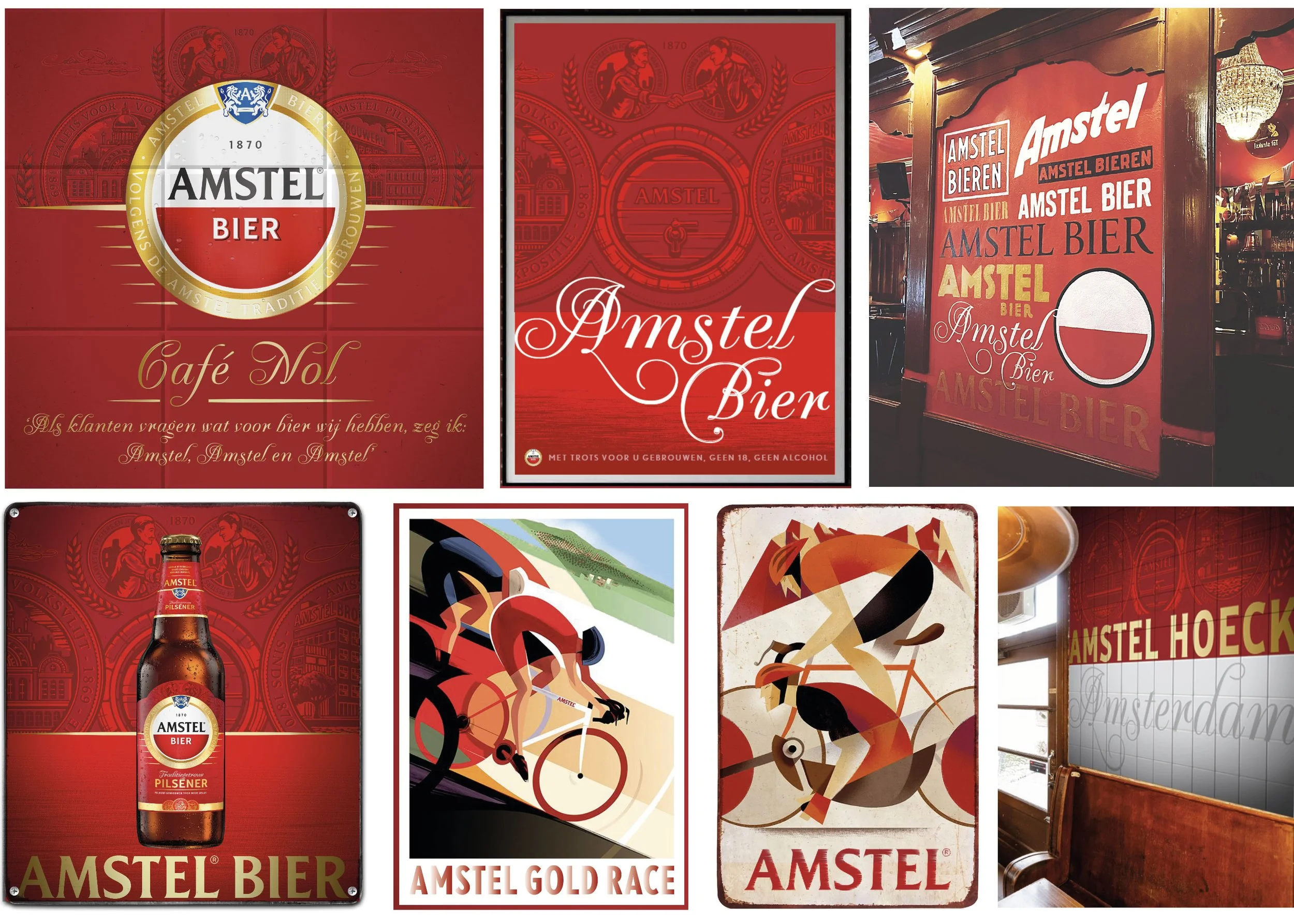
the golden Amstel roundel around the logo, restoring its crest and adding golden text within the roundel. Additionally, we introduced a darker red color inspired from traditional bar elements found in classic table tapestry in brown bars, giving the design a more "Bier sjiek" feel.